



How We Built Snow Babe Balloons a Brand That Finally Matched Their Work

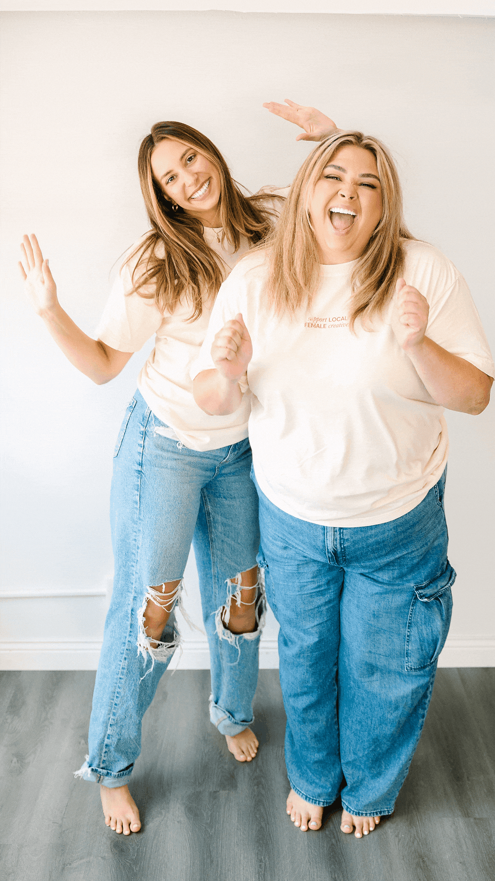
Six years into their business, Brooke and Chelsea — two best friends, sisters-in-law, and mamas based in Charlotte, NC — were ready for a brand that actually looked like them. They had the clients, the referrals, and the talent. What they didn't have was a visual identity bold enough to match it. That's where we came in.


The Brief
Snow Babe Balloons came to us with a clear goal: stand out from Charlotte's balloon scene. And when you look at the competitive landscape — soft pink logos, pastel arches, script wordmarks that all blur together — the opportunity was obvious. The bold, maximalist corner of the Charlotte market was wide open. We just had to help them claim it.
Their dream client is a south Charlotte mom — Ballantyne, Waxhaw, Fort Mill — with a budget, a Pinterest board, and zero time to DIY. She wants to hand off the vision and have it come back better than she imagined. She books on referral, she stays loyal, and she posts everything. Building a brand that could attract and keep that client was the whole game.
The Strategy
Before we touched a single color or font, we built the foundation. That meant a full brand strategy framework — vision and mission statements, six core values, a buyer persona, audience and brand archetypes, competitor analysis, positioning statement, tone of voice spectrums, word bank, and a full StoryBrand journey.
Snow Babe's positioning landed here: the bold, maximalist alternative to Charlotte's pastel balloon scene — built by two best friends who treat every client like family, not a transaction. Their brand archetypes are the Jester and the Creator. Their audience archetypes are the Lover and the Innocent. Their voice skews warm, personal, playful, and showy — not polished, elegant, or corporate.
The strategy made everything that came after easier, because we knew exactly who we were designing for and why.
The Moodboards
We developed two full moodboard directions before landing on the one that clicked.
Direction 1 — Saturated and Sweet — pulled from the retro, Y2K-doodle energy running through Brooke's own Pinterest board. Checkerboard patterns, hand-lettered type, the "Layers of You" burgundy stripe graphic, the chicken-in-boots illustration. Bold, rounded, feminine, and a little nostalgic.
Direction 2 — Vibrant Maximalist — went harder. Primary color palette, Bauhaus-influenced graphic shapes, disco-ball sparkle, chunky condensed type, vintage sticker energy. More graphic, more gender-neutral, louder.
They gravitated toward Direction 1 immediately — and honestly, so did we.
The Color Palette
The palette came together around six colors, each with a name that actually means something:
Snow Babe Blue — a true periwinkle that no other Charlotte balloon brand is touching. This is the color that makes the brand impossible to copy. Bold, confident, and completely ownable.

Lil Wayne's Fav — a burnt orange that starts the conversation. Warm, loud, and unmistakably maximalist. It lives in the script, the balloon, and every place the brand needs to feel alive and turned up.
After Party — a deep plum that anchors everything without going flat or corporate. Rich, grounding, and a little unexpected — it shows up in every outline and stroke without stealing the show.
Sweet Thang — a dusty pink that keeps the palette from feeling too intense. Warm, nostalgic, and charming enough to feel unmistakably Snow Babe.
Perfect Pear — an earthy olive green that grounds the brighter colors around it without competing for attention. The neutral that makes everything else look more intentional.
Tired Latte — a warm khaki cream that gives every bold choice in the palette room to breathe. The color every busy Charlotte mom knows intimately.
The Logo System
The primary logo is a stacked wordmark built on Happy Club — a chunky, rounded display font that's confident and a little retro, with enough personality to feel handmade rather than corporate. The script "balloons" underneath is set in Creamy Smiley, adding a softer, hand-lettered warmth to the bold letterforms above it.
A single illustrated balloon sits tucked into the negative space between SNOW and BABE, its string flowing directly into the "balloons" script below — connecting the icon and type into one seamless system. Burst balloon elements flank the wordmark on both sides, adding movement and personality without overwhelming the type. The whole thing is wrapped in a deep plum sticker outline that unifies every element into one cohesive, instantly recognizable shape.
The full logo system includes a primary stacked wordmark, a horizontal secondary lockup, and an SB brand mark — all consistent across the same color system and visual language.
Nunito Sans handles body copy across all applications — clean, approachable, and just rounded enough to feel like it belongs in the same family as the display and script fonts above it.
The Icons and Surface Patterns
Here's where the brand world really comes alive — though it's worth noting these aren't included in the mini brand package. They're always available as an add-on, and we genuinely cannot help ourselves, so we designed them anyway.

The icon suite includes a chicken holding balloons in cowboy boots, a party-hat chicken floating on a balloon, a balloon flower, a Stanley cup with the SB logo on it, a disco ball, a birthday cake slice, and a cowboy boot with flowers. Each one is illustrated in the same chunky outlined hand as the logo system — playful, slightly retro, and completely ownable.
The surface patterns extend the brand into a full visual world — a hand-painted checkerboard in After Hours plum, and an icon scatter on Tired Latte cream that turns the full illustration suite into something that could live on tissue paper, packaging, backdrops, or wrapping paper.
The Result
They didn't ask for a single revision. First round, done, loved it. That's what happens when the strategy does its job — every design decision has a reason, and the client can feel it.
Snow Babe Balloons has a brand that's bold enough to stand out, warm enough to feel personal, and distinctive enough that no one in Charlotte can touch it. The bold corner of the market was wide open. Now it's claimed.
If your brand has outgrown what you built it with, we'd love to hear your story. Every project starts with a strategy session, not a mood board, because the brand should always come from the truth of who you are first. Ready to see what that looks like for your business?


_gif.gif)


